
 360 1216")

 Upwork
 Fiverr
 People Per
Hour
People Per
Hour
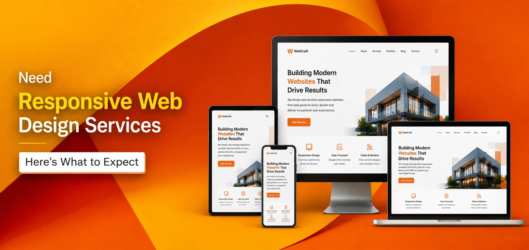
Need Responsive Web Design Services? Here’s What to Expect
 By Manoj Kandwal
|
01-Jul-2026
By Manoj Kandwal
|
01-Jul-2026
People do not stick to one screen anymore. A customer checks your business on a phone during lunch, looks again on a tablet that night, then finishes the purchase on a laptop the next day. If your site looks broken or loads slow on any one of those screens, you lose that person before they see what you actually offer.
This is why so many owners look for responsive web design services. They want a site that shifts smoothly across every screen size and keeps people engaged no matter how they show up. Below, we cover what these services include, what affects the price, how design connects to SEO, and what separates a good web partner from a weak one.
Build a Website That Works for Every Visitor
Get a responsive, SEO-friendly website that looks professional on every screen and helps turn more visitors into customers.
Why Responsive Web Design Is No Longer Optional for Modern Businesses
Most people open their phone first. They search, scroll, and compare while they stand in line or sit on the couch, and they expect a page to load fast and read clearly no matter what device they hold. A clunky mobile site pushes them straight to your competitor, often within seconds.
Search engines expect the same thing. Google grades a site on how it performs on mobile, not on desktop, so a page built only for big screens loses ground in search results fast. A broken layout also hurts how people see your brand. A messy site tells visitors the business behind it is careless. A clean site that adjusts itself builds trust before a visitor reads a single word.
What Responsive Web Design Services Actually Include
A real responsive project involves far more than a homepage that shrinks to fit a phone. It starts with a design strategy that plans how content rearranges across devices, then moves into mobile optimization, where images, buttons, and menus get sized for smaller screens.
Speed matters just as much as looks. A skilled developer compresses images and trims unused code so pages open fast even on a weak connection. Cross-browser checks make sure the site works the same way on Chrome, Safari, and Firefox. Testing does not stop at launch either. A good team keeps checking the site as new devices and browser updates roll out.
How a Responsive Website Improves the Customer Journey From Start to Finish
Visitors judge a site within a few seconds. If the menu confuses them on a phone, they leave before they even find what they came for. A responsive layout keeps navigation simple and buttons easy to tap, which removes that friction.
When product details, prices, and contact info sit right where people expect them, visitors spend less time hunting and more time deciding. That shorter path leads to faster decisions and keeps people on the page longer, which raises overall engagement across the board.
Why Small Businesses Benefit the Most From Responsive Web Design
Small businesses often go up against bigger companies with much bigger budgets, so every edge counts. Web design services for small business owners focus on making a modest budget stretch further by building a site that performs well without pricey extras. A responsive layout gives a local shop the same polished feel as a national chain.
Trust drives whether someone calls or books. A clean mobile site tells a visitor the business behind it is real and active. That trust often turns into more local leads, especially for service businesses that depend on nearby customers who find them through search.
The Essential Features Every High-Performing Responsive Website Should Have
A handful of features separate a strong responsive site from an average one. Skip even one of these, and the rest of the site can still fall flat with visitors.
| Feature | What It Does | What Happens Without It |
|---|---|---|
| Mobile first layouts | Puts small screens first, then scales up for larger ones | Desktop-heavy designs break or crowds on phones |
| Fast-loading pages | Keeps load time low so visitors do not wait | Bounce rates climb and people leave before the page finishes |
| Responsive images | Resizes automatically without losing quality | Photos stretch, blur, or slow the page down |
| Simple navigation | Works with a thumb, not just a mouse | Menus become hard to tap and visitors get lost |
| Clear call to action buttons | Sits where eyes naturally land on the page | Visitors leave without taking the next step |
| Accessibility features | Readable fonts and strong color contrast | Some visitors cannot read or use the site at all |
How Responsive Web Design Helps Visitors Stay Longer and Take Action
When a site shifts smoothly across screens, people stay longer simply because nothing feels off. That alone drops bounce rates, since fewer visitors leave out of pure frustration with tiny text or broken buttons.
Clear text keeps people reading instead of squinting or pinching to zoom. Simple layouts nudge a visitor toward the next step, whether that means a form, a call, or a purchase. Once the basic experience feels smooth, conversions rise, and visitors leave more satisfied with the whole interaction.
Why Responsive Web Design and SEO Deliver Better Results Together
Design and rankings are not two separate jobs. They work as one system. Web design and SEO go hand in hand because search engines check how a site performs on mobile before they rank it for any keyword at all.
Google uses mobile-first indexing, which means it looks at your mobile site to decide where you rank, not your desktop version. Clean code and clear structure improve how easily search engines crawl your pages. Better Core Web Vitals, the metrics that track speed and stability, give Google another reason to trust your site over a slower rival.
How Responsive Websites Improve Visibility in AI Search and Traditional Search Engines
AI search tools now pull answers straight from web pages, and they favor content that loads fast and reads clean. Clear headings and organized sections help these tools understand what a page covers so they can pull the right snippet.
Fast pages and strong engagement signal quality to both AI tools and standard search engines. A site built with clean HTML and a logical layout is easier for these systems to index and recommend over a competitor with cluttered, messy code.
Responsive vs. Non-Responsive Websites: Which One Gives Better Business Results
Put the two side by side, and the gap becomes clear fast.
| Feature | Responsive Website | Non-Responsive Website |
|---|---|---|
| User Experience | Excellent | Poor |
| Mobile Performance | Optimized | Limited |
| SEO Potential | High | Low |
| Bounce Rate | Lower | Higher |
| Maintenance | Easier | More complex |
| Conversion Potential | Higher | Lower |
A nonresponsive site may work for a while. Over time, though, it costs far more through lost traffic and lost rankings than a proper build would have cost upfront.
Understanding Web Design Packages Before You Invest
Web design packages usually bundle design, development, basic SEO setup, and a set number of revisions into one price. Knowing what sits inside each tier helps you avoid paying for things you never use, or worse, missing something you actually need.
Pick the package based on your goals, not the lowest number on the page. A local business might only need five clean pages and a contact form. An online store needs product pages, payment tools, and inventory tracking built in from day one.
How to Find Affordable Web Design Services Without Sacrificing Quality
Affordable web design services should still cover the basics: mobile design, simple SEO, and a clean layout, not just a low sticker price. Cut corners on those basics and you often pay more later to fix problems or rebuild the whole site.
Ask about hidden fees before you sign anything, including charges for extra edits, stock photos, or hosting. Ask about timeline, support after launch, and what happens if you need changes months down the road. Those answers tell you whether a cheap quote is a real deal or a trap.
When Shopify Is the Right Choice for a Responsive Ecommerce Website
Online stores often do best with a Shopify web design agency because the platform handles products, payments, and stock in one place. That setup makes it far easier to scale as your catalog grows.
Mobile purchases now make up a huge share of online sales, so a Shopify store needs to load fast and check out fast on a phone screen. Store scale also matters here. A well-built Shopify site can absorb a traffic spike during a sale without crashing on you.
What to Expect From Professional Shopify Web Design Services
Solid Shopify web design services focus on layouts that push a visitor toward a purchase rather than just letting them browse. Product pages need sharp images, honest descriptions, and visible prices so shoppers never have to dig.
A faster checkout cuts down cart abandonment, one of the biggest revenue leaks for any online store. Product page work, from quick-loading images to thumb-friendly buttons, keeps shoppers moving forward instead of giving up halfway through.
Why WordPress Continues to Be One of the Best Platforms for Responsive Websites
WordPress stays popular for good reason. Owners can add a blog, a portfolio, a booking tool, or a member area without switching platforms. Skilled WordPress web designers build these add-ons in a way that fits the layout instead of breaking it.
Many WordPress themes and plugins come with SEO advantages built right in, which gives a new site a head start in search results. Owners can also update text, swap images, and add pages themselves after launch, without a developer on call for every small change.
How to Choose the Right WordPress Web Designer for Your Business Goals

Not every web designer WordPress professional works at the same level, so check their background before you hire. Technical skill matters most around plugin choices, site speed, and security updates.
A strong portfolio shows you their style and whether it fits your brand. SEO knowledge separates a designer who just builds pretty pages from one who builds pages that actually rank and bring in traffic long after launch.
The Most Common Responsive Web Design Mistakes That Hurt Business Growth
Even well-planned projects slip on a few common mistakes:
- Skip mobile checks until after the desktop version is done
- Slow pages caused by heavy images or bloated code
- Confusing menus with too many items or unclear labels
- Weak call to action buttons that blend into the page
- Poor accessibility that shuts out screen reader users
Catch these early and you save real time and money compared to fixing them after the site goes live.
Responsive Web Design Trends That Will Shape Business Websites in 2026
Design keeps pace with new tech. AI tools now speed up layout work while still leaving room for a brand to stand out. Personalized content, where the page shifts based on visitor behavior, shows up on more business sites each year.
Accessibility gets more attention too, as owners realize the value in serving every visitor well, not just the average one. Interactive layouts and voice-friendly navigation continue to grow, especially as more people search and browse through voice assistants.
Industry Statistics That Show the Real Business Impact of Responsive Web Design
Mobile traffic climbs every year, and most sites now see the bulk of their visitors arrive from a phone, not a desktop. Sites that adapt well to mobile screens report stronger conversion numbers than the ones that do not.
People abandon a slow or confusing site within seconds, and the data backs this up again and again. Speed and responsiveness directly shape how long a visitor stays and whether they act before they leave the page.
How Responsive Web Design Helps Generate More Leads and Sales
A better experience keeps a visitor around long enough to actually consider your offer. That builds trust, since a polished site suggests a solid business stands behind it.
Higher conversion rates follow once visitors trust what they see and can move through the site with ease. Repeat visitors remember a smooth experience and come back without a second thought the next time they need what you sell.
Why Investing in Responsive Web Design Saves Money Over Time

Keep two separate sites, one for desktop and one for mobile, and you pay far more than you would for one responsive site built right the first time. One codebase means lower upkeep costs and fewer headaches down the road.
Change your content once, and it shows correctly everywhere. One website across every device, paired with a stronger long-term return, makes responsive design the smarter financial call over a site you patch again and again.
Why Combining Responsive Design With SEO Creates Long-Term Growth
A fast, mobile-friendly site gives your SEO work a solid base to stand on. Work with an organic SEO expert, and you’ll make sure your content targets the right keywords while your site structure backs up the rankings you want.
Partner with an AI SEO company, and you add another layer, since these teams understand how AI search tools now judge and rank content. Together, this pairing builds steady organic traffic and stronger visibility that compounds over months instead of fading after a short burst of activity.
Questions Every Business Should Ask Before Hiring a Responsive Web Design Company
Ask about the project timeline before you sign anything, and get clear on what milestones to expect along the way. Ask about pricing too, so you know exactly what the quote covers and what might cost extra later.
Look closely at their past work, not just polished screenshots pulled from a portfolio page. Ask about support after launch, and ask whether the team actually knows SEO, since a pretty site with zero visibility will never bring in customers.
Signs You’ve Found the Right Responsive Web Design Partner
A strong partner brings real experience with businesses like yours, not a stack of generic templates reused for every client. Clear, honest communication throughout the project keeps surprises off the table.
Real client reviews give you honest insight into how a company handles actual projects and actual problems, not just the sales pitch. A transparent process and support that continues after launch show a company cares about your results, not just the check they cash on day one.
Why Businesses Trust WillShall Consulting for Responsive Web Design Services
Businesses that search for reliable, responsive web design services usually want a team that handles both design and long-term strategy. Mobile-first development means every site performs well from the first day it goes live, and an SEO-ready structure gives clients a head start in search results.
Shopify and WordPress skills give flexibility depending on what each business needs. A conversion-focused strategy keeps the end goal in view through the whole build, and support after launch helps a business adjust as its needs change over time.
Final Thoughts: Invest in Responsive Web Design That Supports Long-Term Business Success
A responsive website is not a one-time cost. It is a long-term asset that supports a better experience, stronger SEO, and higher conversions for years after launch. Pick the cheapest option on the table, and you often pay more later through lost traffic and a rebuild you did not plan for. Businesses that team up with an experienced partner, including firms like WillShall Consulting, tend to see steadier growth because their site can adapt instead of break under new demands. Put real money into quality responsive web design services now, and you set the base for stronger results down the road.
Ready to Build a Website That Delivers Better Results
Contact WillShall Consulting today to create a responsive website designed to rank higher, load faster, and convert more visitors into loyal customers
I bring a wealth of knowledge and experience to WillShall Consulting with two decades of expertise in Website Design, Development, and Digital Marketing, My journey has been marked by a passion for creating innovative web solutions that not only meet but exceed client expectations. As an avid analyst, I dedicate myself to understanding each customer’s unique needs, ensuring that our web solutions are not just functional but exceptional.
Frequently Asked Questions about Responsive Web Design Services

Looking to boost your online presence and reach more customers in your local area?
Explore Local SEO ServiceKnow your website’s SEO Score.
Get a customize SEO Audit report & improve your website statistics.
